
Interior Architect/ Designer
Are you original, creative, dynamic and super organised???? Then get in touch as we have an exciting job opportunity for an interior architect/ designer to join our small but growing team to work on all phases of the design process. We will consider candidates on creative ability and technical combined. The role will cover all phases of the design process and the candidate must demonstrate a passion for design and commercial interiors as well as excellent attention to detail.
At Tess Stanford we want to attract an individual with the right skills and mindset that reflect our mission: To transform business through a brand story. We have a huge portfolio of work with our commercial interior projects ranging from hospitality, retail, exhibition, airport, office, public sector and branded environments. Whilst the role will be Irish based and in Limerick, the role will offer exposure to current international projects undertaken with our London partners.
ROLE CRITERIA
- Candidate must hold a degree in interior architecture/ design.
- Candidate must have a good knowledge of Autocad or Vectorworks..
- Knowledge of Adobe packages: Photoshop and InDesign
- Have 2 – 3 years minimum industry experience with relevant portfolio of work.
- Demonstrate creative ability and a genuine passion for design and interiors.
- Attention to detail.
- Site experience.
- Fluent in English with excellent written and verbal skills.
- Able to work independently unsupervised whilst willing to work as part of a team and understand direction.
- Demonstrate experience in tender drawings and specification documents.
- Responsible and highly organized.
ROLE RESPONSIBILITIES
- Carry out site surveys.
- Contribute to brainstorm sessions.
- Contribute to all stages of our design process.
- Attend client meetings.
- Attend design team meetings.
- Liaise with external design team consultants.
- Produce detailed drawings for bespoke fixtures and furniture.
- Tender and construction drawing packages for commercial interior projects, ensuring all proposals comply with relevant building regulations.
- Sourcing of products and pricing.
- Coordinate various suppliers and create job spreadsheets for financial and orders.
- Organise site schedules with builders and external suppliers.
- Prepare design presentation documents.
Please email your CV with examples of work, with INTERIOR ARCHITECT/ DESIGNER in the title to: enquiries@tess-stanford.com
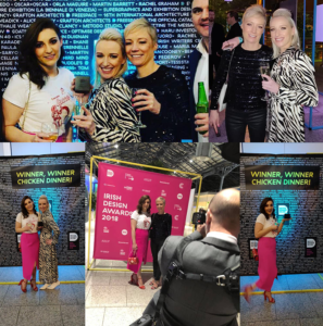
Irish Design Awards. Commendation Award for Best Commercial Interior
Irish Design Awards 2018. Commendation Award for Best Commercial Interior
JJ Ruddle’s @ Shannon Airport [Tess Stanford, Lead Designer]:
Branding by Creative Practice, Photography by Leon Murphy, James Hartnett, Architectural Technician, Structural Engineers McKenna Consulting Engineers, QS Tom Kerin COMMENDED

CAD TECHNICIAN/ INTERIOR ARCHITECT
Exciting opportunity for CAD technician or interior architect to join our small but growing team to work on all phases of the design process with particular emphasis on technical detailing and site. We will consider candidates on purely technical ability or creative design and technical combined. The role may also cover other phases of the design process and the candidate must demonstrate a passion for design and commercial interiors as well as excellent attention to detail.
At Tess Stanford we want to attract an individual with the right skills and mindset that reflect our mission: To transform business through a brand story. We have a huge portfolio of work with our commercial interior projects ranging from hospitality, retail, exhibition, airport, office, public sector and branded environments. Whilst the role will be Irish based and in Limerick, the role will offer exposure to current international projects undertaken with our London partners.
ROLE CRITERIA
- Candidate must hold a degree in interior architecture, architectural technician or similar.
- Candidate must have a good knowledge of Autocad or Vectorworks & 3D rendering experience.
- Knowledge of graphic packages: Photoshop and InDesign is preferred.
- Have 2 – 3 years industry experience with relevant portfolio of work.
- Demonstrate creative ability and a genuine passion for design and interiors.
- Attention to detail.
- Site experience and construction supervision is essential.
- Fluent in English with excellent written and verbal skills.
- Able to work independently unsupervised whilst willing to work as part of a team and understand direction.
- Demonstrate experience in tender drawings and specification documents.
- Responsible and highly organized.
ROLE RESPONSIBILITIES
- Tender and construction drawing packages for commercial interior projects, ensuring all proposals comply with relevant building regulations.
- Attend client meetings.
- Attend design team meetings.
- Carry out full initial site surveys.
- Liaise with external design team consultants.
- Produce detailed drawings for bespoke fixtures and furniture.
- Sourcing of products and pricing.
- Coordinate various suppliers and create job spreadsheets for financial and orders.
- Organise site schedules with builders and external suppliers.
- Opportunity for 3D modelling and visualization of projects.
- Contribute to brainstorm sessions.
- Prepare design presentation documents.
Please email your CV with examples of work, with CAD TECHNICIAN/ INTERIOR ARCHITECT in the title by January 17th to: enquiries@tess-stanford.com.
Interior Design Colour Inspiration Blog No 019 – 021


Colour Inspiration
“A karst landscape of bedrock incorporating a vast cracked pavement of glacial-era limestone”, otherwise known as The Burren, Co.Clare. Rock for miles and all this rock leads us into a stunning and beautiful world of blues and greys.
Choosing your palette
Blues and greys are complimenting colours but can appear cold so care in choosing the right tones is paramount. Here our shot by Martin Kiely gives us a great palette, if adventurous.
Navy blues and mustard yellows set in amongst endless greys, blue greys and light green greys. Gold and brass metals are introduced to compliment the mustard shades and create beautiful details in this dramatic palette.
This is bold and not for the faint-hearted, but its rich and luxurious.
Be brave Enjoy!
Product References
No 019
Image from Houzz.com, photographer Charlie Birchmore Photography Ltd., Rockett St George – Gatsby Marble & Brass Effects Drinks Trolley, Cox and Cox – Timsbury Velvet Sofa,The Little Green Company Paint – Hick’s Blue (208), Zara Home – Round Gold Nest of Tables, The little Green Company Paint – Celestial Blue (101). Cushion – Pinterest.
No 020
Image one from Style by Emily Henderson, Bed Image from Pinterest, Dressing table image form House and home Magazine, Navy Velvet Chair from Black Rooster Decor Pinterest, Marks & Spencer Weave Cushion on Duck Egg, Marks and Spencer Soft Fleece Throw. The Little Green Company Paint – Celestial Blue (101)
Interior Design Colour Inspiration Blog No 016 – 018


Colour Inspiration
Sundown, when light fades and darkness falls. This photo proves that even a dark environment throws up yet another beautiful palette.
How to make a dark beautiful room?
Every time I meet a client, they leave the dark room until last to show me. ‘We’ve tried everything yet it just doesn’t work’, and every time it transpires they have tried to brighten the room.
I believe you should leave a dark room dark but make it a beautiful dark room. Lighter colours will just not perform the same way as in a room full of daylight. Colours tend to look more vivid in daylight. It may be added that under daylight the human eye can differentiate between half a million different shades, while under normal fluorescent lighting the corresponding figure is 8! There have been huge advances in lighting in recent years with the availability of natural daylight bulbs which offer the ability to read more colours in artificial light. However, these are often reserved for commercial working environments so back to my argument for making a dark room a beautiful dark room.
Take a look at our boards. This colour palette is rich and dark yet still warm. Any lighter tones are heavily unbalanced by much darker shades. The proof of how little you should use is in the photo and supported by the mood images.
Try not to be afraid of darker shades. Once you add some warm lighting, this room will come to life. Remember to can still add textures, woods, fabrics etc. Use warm led light fittings as they will offer less light than the cooler blue toned bulbs. They’ll give a more intimate, moody light. The darker the better!
Embrace your dark side!
Enjoy
Product References
No 016
Dark wooden paneling Pinterest Image, Light Kartell KTrib S2 Pendant Bronze Shade, Staircase Pinterect image, Black frames Pinterest Image, White ceiling Pinterest image, Kennan Console Table by Restoration Headwear, Farrow & Ball Paint Off-Black No 57, Heal’s Shear Table lamp Chrome & Matte Old English White.
No 018
Bathroom Image from Malvern Australia, Bathroom image from Hyla Architecture Greenbank park, Zoe concrete and brass vanity basion from Wood Melbourne, Porcelain tiles Amore from tiles.co.uk, Vintage wall light from DHgale, Farrow and Ball Paint Deep dark blue.
Interior Design Colour Inspiration Blog No 013-015


Colour Inspiration
Green, the Pantone colour of the year combined with chocolate browns. Good enough to eat, this palette is!!
According to Pantone “Greenery is nature’s neutral. The more submerged people are in modern life, the greater their innate craving to immerse themselves in the physical beauty and inherent unity of the natural world. This shift is reflected by the proliferation of all things expressive of Greenery in daily lives through urban planning, architecture, lifestyle and design choices globally. A constant on the periphery, Greenery is now being pulled to the forefront – it is an omnipresent hue around the world.”
Why Choose Green?
Bascially green is now being introduced across all aspects of design and architecture. Green is seen as a sign of life and known to be a great balancer.
It is believed to be a colour to get rid of negative emotions and mental stress, it reduces over-stimulation and restores stability in other words balance and harmony. It is known in holistic circles as a colour of healing.
Wowsers, let’s get some green into a palette I thought. It’s everywhere in nature and not being a fan of the particular Pantone colour of the year huge, together with team we found our own tones. I wanted a real depth of colour in the greens to be complimented by a colour that would add a richness to the palette.
The Atlantic, ocean provided the inspiration. The result is rich, it’s sumptuous, it’s almost edible.
Enjoy!!!
Product References
No 013
Rhea Curtain and Upholstery Fabric, Dark Bedroom image by Paul Zagrabchuk, Mindwest Där Ranger table lamp, Colourtrend Bridle Path, Made Range Round Coffee Table, Dark Stain Ash Veneer and Brass, Pergo laminate flooring .
No 015
Kitchen image Pintrest (abduzeedo.com), Colourtrend Verdant Leaf, Kettle from pintrest, Dining table Heals Axel Dining Table by Timothy Oulton, Kartell Masters Precious Philippe Starck, Pergo laminate flooring .
Interior Design Colour Inspiration Blog No 010-012


Colour Inspiration
Amazing view and these colours are just so, so soft. They as so close tonally that they almost just blend together. This is a hugely relaxing palette, really dreamy then brought to life by the amazing pop of royal blue.
Choosing your Colour Palette
Here is your opportunity to introduce rich dark royal blue into your interior, represented here by a sumptuous velvet sofa in our living room palette. We were dying for an opportunity to use Irish Designer, Aoife Mullane’s fabrics and this is it: beautiful rose gold metallic’s, pinks and blues.
The cooler blues, greens and greys then offer a spa like sanctuary feel to the bathroom palette. The hero of the room is the Brayden Bateau Cast Iron Skirted Bathtub, which could also act as your feature in royal blue.
This is a soft, relaxing, cool, calming, natural palette.
Enjoy!
Product References
No 010
Aoife Mullane Design – Cushions, Ragno – Woodpassion collection, Anthropologie – Velvet Lyre chesterfield Sofa Wilcox, Cox & Cox – Lina Side Tables, Farrow & Ball – Parma Gray Paint.
No 012
Duravit Sink, Ragno studio Decoro Cementine tile, Farrow & Ball Wallpaper –Orangerie, Signature Hardware – Brayden Bateau Cast Iron Skirted Bathtub, Bella Freud – Eau De Parfum, Farrow & Ball – Parma Gray Paint.
Interior Design Colour Inspiration Blog No 007-009


Colour Inspiration
Stunning example of how pops of colour can bring your interior to life. Ever fall in love with a piece of furniture in a vivid colour and wonder how to work the rest of your room around it? My advice, find the colour in nature and just let the environment, or in this case the bird do it for you.
Choosing your Colour Palette
The interior design of your home is about you and those living in your home. If your personality is bold and vibrant, let your room reflect that. We love this image of the blue footed Booby bird and it’s amazing turquoise legs! The bird’s feathers give us gorgeous chocolate and dark browns, mixed with softer creamier tones. The environment offers us a softer pinky beige palette with a fabulous pop of lime green.
Be bold and have fun!
Product References
No 007
Frilly Chair by Kartell, Reflection Candlestick Large by Stelton, Axel Dining Table by Timothy Oulton Colourtrend Piano Key, Waterford Crystal Mixology Neon Decanter Lime Green, Lome vintage braided pendant light by Mullan lighting.
No 009
Rangno Woodmania Ivory, Nightingale teal blue velvet sofa by the french bedroom company, Habitat Rug, Colourtrend Souffle, Limegrass plant, Colourtrend soda bread, Mirror Purves
Interior Design Colour Inspiration Blog No 004-006


Colour Inspiration
Being by the sea has such a calming effect on so many people and I believe the colour palettes in these natural settings will have the same effect in your interior design palette.
I got so excited when I saw the tones captured by our photographer Martin Kiely of this beach on Inishbofin Island. Inishbofin is located off the west coast of Ireland and is one of the most tranquil places I have ever visited. This shot is such a beautiful example of blue complimented in a really warm palette.
Choosing your Colour Palette
Blue can be a cold colour if not used correctly but the richness of the blues on the horizon picked from this shot are warmed by ashy brown and grey tones from the beach and rocks. If you are keen to introduce blue into your Interior design palette and want to avoid the coolness associated with blue then it’s important to choose your complimenting palette appropriately. The gorgeous sandy pinks in the sand have allowed us to introduce rose gold & copper metal accessories and add a little wow that we all love.
The teaming of the tones in this palette is a wonderful way of keeping your interior warm and rich whilst allowing you to introduce your blue as a major feature.
Interior design of your home is meant to be fun and an expression of yourself. If this palette resonates with you then you’ve got a wonderful starting point.
Palettes in nature, they just work somehow…
Product References
No 004
Kitchen image @ Pinterest. Kitchen blue paint: Farrow & Ball Stiffkey Blue no. 281. Waltham Pendant Light by Birch Lane. Kitchen image @ Pinterest: Sustainable Kitchens. Kitchen floor tile Ragno, Trace Collection, Beige. Bristow Metal Bar Stools Antique White. Kitchen image @ Pinterest
No 006
Bathroom image @ pinterest. Wall tile: Ragno, Energy Indaco Struttura Marea 3D. Paint colour: Farrow & Ball Dead Salmon No.28. Floor Tile: Ragno Woodgrace collection. 3D wall tile: Ragno, Terracruda Collection: Concrete Look. Copper wall mounted wash hand basin mixer. Thermo Exposed Shower in Aged Copper Finish by Catchpole & Rye Bathrooms.
Interior Design Colour Inspiration Blog No 001 – 003


Anybody can design their own living space, for some it just comes naturally for others a little helping hand and a starting point is all that’s required. I get asked by so many people for help on colour. Its seems to be the biggest challenge and people are afraid to experiment and afraid to make a wrong choice. This is such a shame as colour is the most exciting part.
I’ve been observing people in spaces for years, how they react to space and colour and how colour reacts in a space and to light. For me, it just seems natural, I love playing with tones and creating palettes that enhance and affect your mood, whether it be commercial or domestic interior.
So many people want inspiration on colour palettes and it’s not possible for each to hire a designer. This got me thinking…
For as long as I remember, I get lost looking at tones in nature, the most complimenting palettes are right in front of us. Vivid colours just pop out against other vibrant tones and sometimes form the most outrageous combinations, but it just works. Others are soft and relaxing, I could be here all day describing scenarios so instead I’ve created this blog to help translate what I see. Nature gives us perfectly beautiful palettes and I’m giving these to you to in a form that I hope inspires you and your home.
This blog is intended to be purely inspirational. Over the course of the year myself and the team working on this will be taking you through seasonal changes of colours on land, by the sea and as active scuba divers we are even going to take you under water to a world of colour you might not even have been aware of.
Let the fun commence…
Product References
No 001
Colortrend Shell Cove, EZ Living Nickel Table Lamp, Frame Carpet Floor Tile by Refin, Farrow and Ball Purbeck Stone, Laura Ashley Mirror, Farrow and Ball Brocade wallpaper
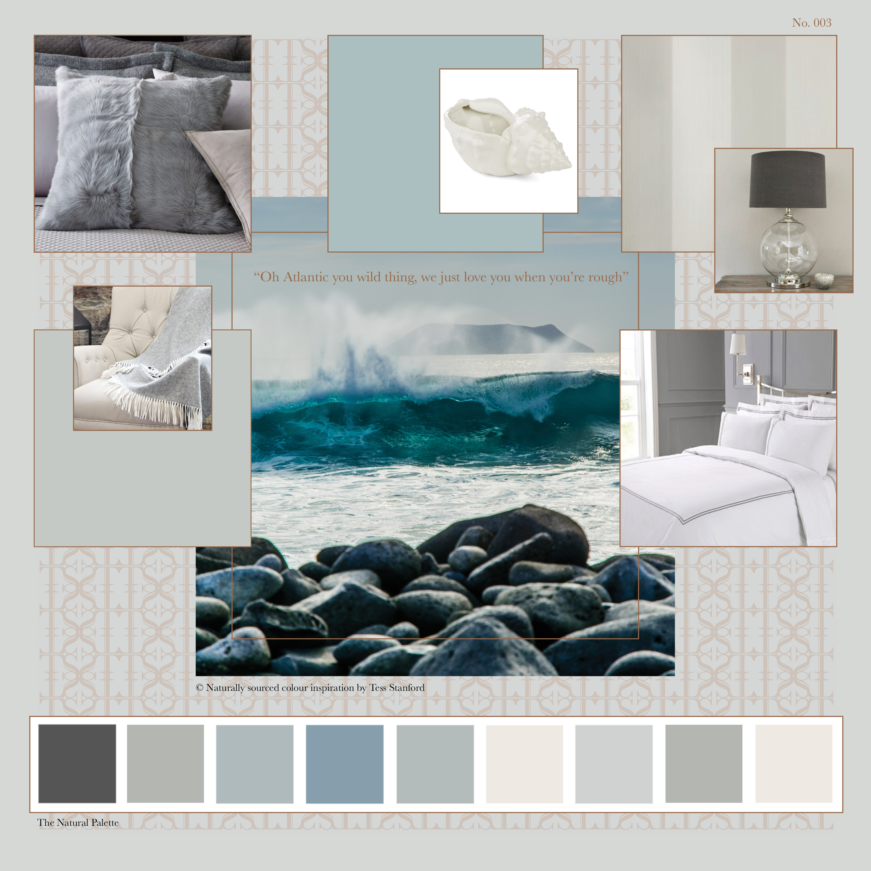
No 003
Ralph Lauren Gabrielle Shearling Pillow, Farrow and Ball Lulworth Blue, Laura Ashley Shell, Farrow and Ball Broad striped wallpaper, Primrose and Plum Glass ball table lamp, Francis Brennan Collection Dunnes Stores, Farrow and Ball Skylight, Meadows & Byrne Throw.